Bento 布局指南
本指南解释了如何有效布局 Bento 组件。
背景:如何避免内容偏移
内容偏移很烦人,避免内容偏移是提供良好用户体验的重要组成部分。内容偏移也是 核心网络指标 的一部分,通过 CLS 指标进行衡量。避免内容偏移的关键是正确布局网页在页面加载时的内容。
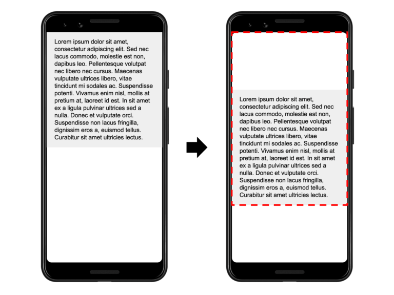
Bento 组件经过优化,可以避免内容偏移。这也是每个 Bento Web 组件都带有自己的 CSS 样式的原因。这些样式确保 Bento 组件在页面加载时正确布局。
<script
  async
  src="https://cdn.ampproject.org/v0/bento-accordion-1.0.js"
></script>
<link
  rel="stylesheet"
  type="text/css"
  href="https://cdn.ampproject.org/v0/bento-accordion-1.0.css"
/>
但是,某些组件需要有关如何在页面加载时布局它们的附加信息。例如,走马灯需要预定义的高度(可以相对于视口大小),你可以通过 CSS 定义该高度。
在本指南中,我们将介绍几种与 Bento 组件(以及 Bento 之外)配合良好的常见布局。但是,并非每种布局都适用于每个 Bento 组件。例如,容器布局方法非常适合 Bento 手风琴,但不适合 Bento 走马灯。
因此,让我们开始布局一些 Bento 组件吧!
布局
容器布局
最简单的布局是容器布局。这意味着 Bento 组件的大小是根据其子组件的大小来确定的,不需要其他信息
<bento-accordion>
  <section>
    <h2>Section 1</h2>
    <div>Content in section 1.</div>
  </section>
  <section>
    <h2>Section 2</h2>
    <div>Content in section 2.</div>
  </section>
</bento-accordion>
固定布局
固定布局是 Bento 组件的另一种简单布局方法。使用固定布局,元素会根据元素的宽度和高度属性保留其固定尺寸
<bento-base-carousel style="width: 400px; height: 300px">
  <div class="red"></div>
  <div class="blue"></div>
  <div class="green"></div>
</bento-base-carousel>
当然,这并不意味着大小不是响应式的。你还可以使用百分比或视口尺寸动态调整元素的大小
<bento-base-carousel style="width: 50vw; height: 50vh">
  <div class="red"></div>
  <div class="blue"></div>
  <div class="green"></div>
</bento-base-carousel>
填充布局
使用填充布局,元素会占据其可用的空间,包括宽度和高度。换句话说,填充元素的布局和大小与其父元素匹配。以下是如何定义填充布局规则
<style>
  .fill {
    position: absolute;
    top: 0;
    left: 0;
    right: 0;
    bottom: 0;
    width: 100%;
    height: 100%;
  }
</style>

<div style="width: 400px; height: 300px; position: relative;">
  <bento-base-carousel style="fill">
    <div class="red"></div>
    <div class="blue"></div>
    <div class="green"></div>
  </bento-base-carousel>
</div>重要提示:要使此方法有效,父容器需要定义position: relative。
固定高度布局
使用fixed-height布局时,元素会占用其可用的空间,但保持高度不变。此布局适用于需要水平定位内容的元素(例如,bento-base-carousel)。此布局通过指定元素的宽度和高度来定义:width: 100%; height: 300px:
<bento-base-carousel style="width: 100%; height: 300px">
  <div class="red"></div>
  <div class="blue"></div>
  <div class="green"></div>
</bento-base-carousel>
响应式布局
使用responsive布局时,元素会占用其可用的空间,并根据元素的宽度和高度属性指定的纵横比自动调整其高度。
新的aspect-ratio CSS 属性使得在 CSS 中声明此属性变得非常容易
<bento-fit-text style="aspect-ratio: 4 / 3"> Hello world! </bento-fit-text>但是,为了获得最大的浏览器兼容性,最好使用使用伪元素的传统方法
<style>
  .fill {
    position: absolute;
    top: 0;
    left: 0;
    right: 0;
    bottom: 0;
    width: 100%;
    height: 100%;
  }
  .aspect-4-3 {
    display: block;
    overflow: hidden;
    position: relative;
  }
  .aspect-4-3::before {
    float: left;
    content: '';
    padding-top: calc(100% * (3 / 4));
  }
</style>
<div class="aspect-4-3">
  <bento-fit-text class="fill"> Saturday 11 April 2018 00.37 </bento-fit-text>
</div>
网格布局和 flexbox
如果 Bento 组件是flex 容器或网格布局的子级,则可以像其他子级一样调整其大小。例如,通过使用flex属性。
<style>
  .flex-centered {
    display: flex;
    align-items: center;
    justify-content: center;
  }
</style>
<div class="flex-centered">
  <bento-base-carousel style="width: 300px; height: 100px">
    <div class="red"></div>
    <div class="blue"></div>
    <div class="green"></div>
  </bento-base-carousel>
</div>